10+ years · 15,000+ happy customers
936+ trusted clients · 99% satisfaction
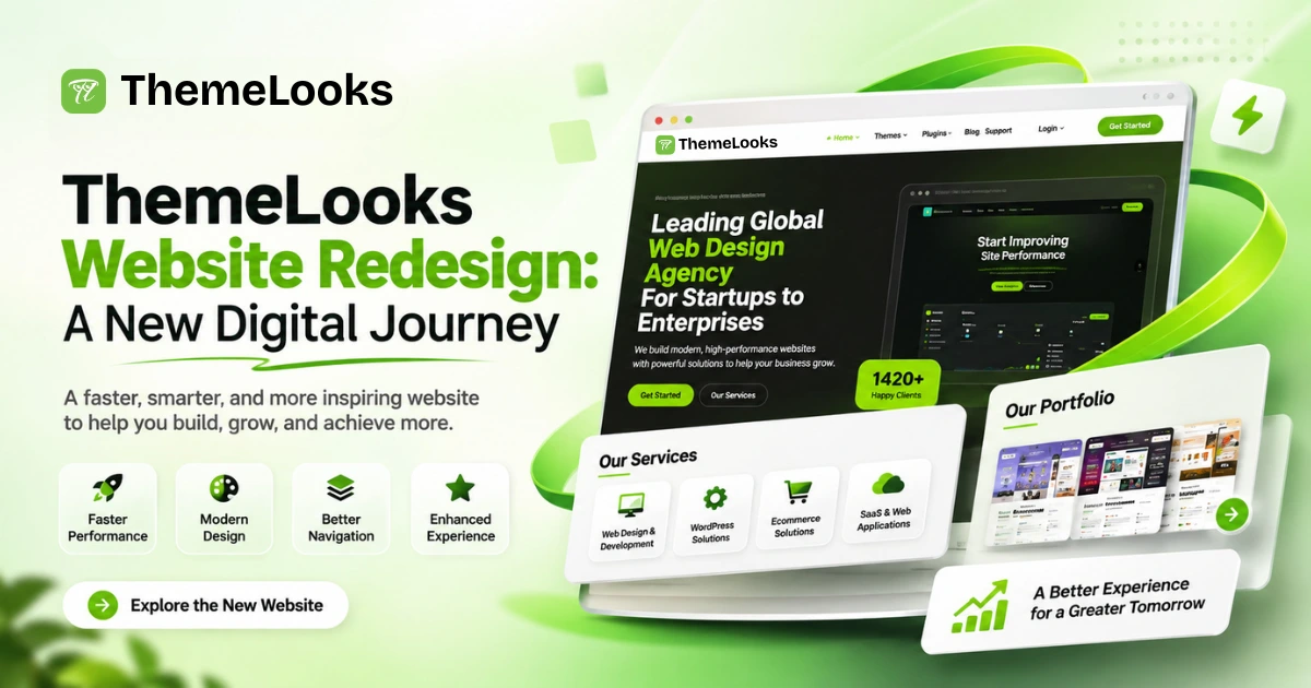
A company’s website is more than just an online presence. It represents its brand identity, communicates its services, showcases its work, and helps potential customers understand what makes the business different.
At ThemeLooks, we believe that a professional website should combine attractive design, clear information, easy navigation, and a great user experience. As our company continues to grow, we also want our digital presence to reflect our evolving expertise in web design and development.
That is why we introduced a completely refreshed design through the ThemeLooks Website Redesign, creating a more modern and engaging experience for our visitors.
The previous version had a clean, light-colored appearance with a traditional content layout. The redesigned website introduces a stronger visual identity, modern layouts, improved content presentation, and a more engaging overall experience.
In this article, we will compare the previous and present ThemeLooks website designs, explore the major improvements, and explain why the redesigned version represents a better direction for our brand.
The most noticeable change is the overall visual direction.
The previous website used a light background, green highlights, and a relatively traditional layout. It presented company information, services, portfolio projects, client testimonials, and frequently asked questions.
The redesigned website introduces a more distinctive combination of dark backgrounds, vibrant green highlights, bold typography, and structured content sections.
The changes go beyond visual appearance. The redesigned version places greater emphasis on content organization, project presentation, company achievements, and clear calls to action.
The result is a more consistent and professional website experience that better communicates the ThemeLooks brand.
The redesigned ThemeLooks website introduces a fresh visual identity with modern layouts, bold typography, and improved content presentation. From the homepage and services to the portfolio and testimonials, we have made seven key improvements to create a more engaging and professional website experience.
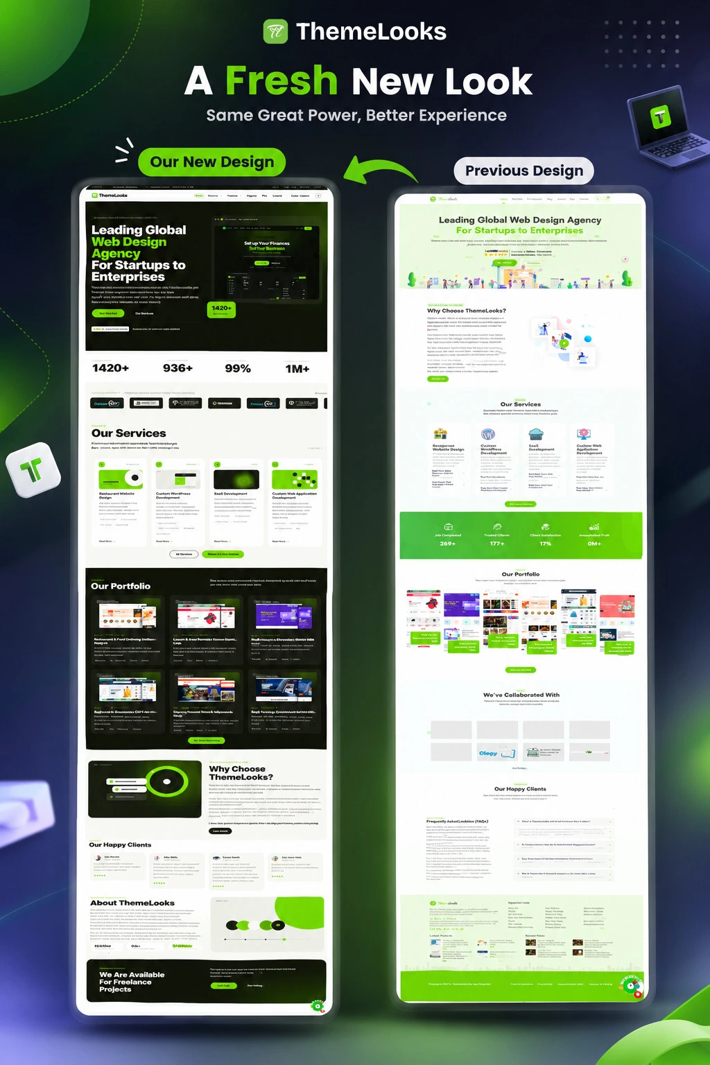
The overall appearance of a website influences how visitors perceive a company.
The previous ThemeLooks design primarily used a light green background with simple content sections. Although the design was clean and informative, it followed a more traditional visual approach.
The redesigned website introduces a stronger black-and-green color combination.
Dark backgrounds create contrast, while vibrant green highlights draw attention to important elements. Bold typography makes headings more noticeable, and consistent spacing creates a cleaner appearance.
These changes give the entire website a more distinctive visual identity.
Why the redesigned version is better:
The first section of a website plays an important role in communicating what a company does.
The previous ThemeLooks design used a light-colored introduction with centered text and supporting illustrations.
The redesigned version introduces a bold headline, a dark background, vibrant green typography, and a website preview.
The new arrangement creates a stronger visual balance between written information and visual content.
The headline communicates the company’s positioning as a global web design agency for startups and enterprises. The website preview also provides visitors with a visual representation of the company’s design approach.
The call-to-action elements are more noticeable, making it easier for visitors to identify the next step.
Why the redesigned version is better:
The new introduction communicates the brand’s identity more effectively and creates a stronger first impression through typography, contrast, and visual presentation.
Company achievements and services are essential parts of a professional business website.
The previous ThemeLooks design presented company statistics further down the page, after the services section.
The redesigned version moves important statistics closer to the beginning of the website experience.
This gives visitors a quicker overview of the company’s achievements.
The services section has also received a significant visual improvement.
Previously, services were displayed in simple columns with illustrations and descriptions. The redesigned version uses individual cards with consistent spacing, visual elements, and green highlights.
This makes the services easier to distinguish and understand.
Why the redesigned version is better:
A portfolio is one of the most important elements of a web design agency’s website.
Potential clients want to see real examples of a company’s work before deciding whether its services are suitable for their projects.
The previous ThemeLooks design presented multiple project screenshots in a wide gallery.
The redesigned version introduces a structured portfolio with individual project cards and a contrasting dark background.
Each project receives its own visual space, helping visitors distinguish between different website designs.
The new arrangement also creates a more consistent presentation across the portfolio section.
Instead of displaying projects as a large collection of screenshots, the redesigned website makes each project feel like a separate showcase.
Why the redesigned version is better:
The new portfolio layout improves project visibility, creates a more organized presentation, and makes browsing the company’s work more engaging.
Visitors often want to know more about a company before choosing its services.
The previous ThemeLooks design included a “Why Choose ThemeLooks?” section and an About ThemeLooks section. Both provided useful information, but the presentation was more text-focused.
The redesigned website gives these sections a more balanced appearance.
The “Why Choose ThemeLooks?” section combines an illustration with supporting text. This creates a visual focal point while explaining the company’s strengths.
The About ThemeLooks section also uses a combination of written information and visual elements.
This approach makes company information more engaging without sacrificing important details.
Why the redesigned version is better:
The new layout creates a better balance between text and visuals, communicates the company’s value more clearly, and maintains a consistent design language.
Client feedback helps visitors understand the quality of a company’s services through the experiences of other customers.
The previous ThemeLooks design included a dedicated client testimonials section, but its presentation had less visual structure.
The redesigned website introduces organized testimonial cards.
Each card provides a separate space for client feedback, making individual reviews easier to distinguish.
The card-based arrangement also creates better consistency between testimonials.
This improvement makes the client feedback section more visually appealing and easier to explore.
Why the redesigned version is better:
The present design gives client feedback a clearer structure and makes customer experiences more accessible to website visitors.
A professional website should help visitors find important information without unnecessary difficulty.
The redesigned ThemeLooks website improves the presentation of frequently asked questions and footer information.
FAQ Section
The previous design displayed questions in a simple vertical list.
The redesigned version introduces an accordion-style layout, allowing visitors to expand individual questions and read their answers.
This keeps the section organized and avoids displaying every answer at once.
Footer Section
The previous footer used a light green background with several information columns.
The redesigned version introduces a dark background with green highlights and more structured information groups.
Company details, important links, and other resources receive clearly separated spaces.
The footer also follows the same visual identity used throughout the redesigned website.
Why the redesigned version is better:
The new FAQ and footer layouts create a more consistent experience and improve the presentation of important website information.
A website redesign should not focus only on appearance. It should also make the website easier to understand and explore.
The redesigned ThemeLooks website introduces several improvements that support a better visitor experience.
The new design uses structured sections, consistent spacing, and clear headings.
Visitors can identify different areas of the website more easily and understand how the information is organized.
Dark backgrounds, green highlights, and bold typography help important information stand out.
This creates a clearer distinction between headings, supporting content, and calls to action.
The new card-based layouts make services and portfolio projects easier to distinguish.
Visitors can explore the company’s offerings and work through a more organized presentation.
The redesigned website follows a more consistent visual direction.
The combination of dark backgrounds, green highlights, typography, and structured content creates a recognizable identity throughout the website.
The improved FAQ presentation allows visitors to explore individual questions without viewing every answer at once.
The more organized footer also helps visitors identify useful links and company information.
Together, these improvements make the redesigned ThemeLooks website more engaging and professional.
The following table highlights the major differences between the two website versions.
| Design Element | Previous Version | Present Version |
| Overall appearance | Traditional and light | Modern and distinctive |
| Brand identity | Light green color scheme | Black and vibrant green |
| Introduction section | Simple centered layout | Bold typography and website preview |
| Company statistics | Positioned further down | More visible near the beginning |
| Services | Traditional columns | Structured service cards |
| Portfolio | Wide project gallery | Individual project cards |
| Why Choose section | Text-focused presentation | Balanced text and visual layout |
| About section | Primarily text-based | Text with visual elements |
| Testimonials | Less structured presentation | Organized testimonial cards |
| FAQ | Simple question list | Accordion-style presentation |
| Footer | Light-colored background | Dark background with green highlights |
Both versions communicate the company’s services and provide visitors with important business information.
However, the present ThemeLooks website design offers a stronger overall presentation.
It introduces a more distinctive brand identity, better-organized content sections, a structured portfolio, and a more consistent visual experience.
The biggest improvement is how different website elements work together. Instead of treating each section as a separate design, the redesigned version creates a more unified experience.
For these reasons, the present ThemeLooks website design is a stronger representation of our company’s expertise and professional identity.
The redesigned website represents more than a visual update. It reflects how we want to communicate our services, expertise, and brand identity to a global audience.
As a web design and development company, we understand the importance of creating websites that combine visual appeal with practical functionality.
Our redesigned website brings together:
These improvements provide a stronger foundation for presenting our services, products, projects, and future developments.
Most importantly, the redesigned website better reflects the quality and direction we want to represent as a web design agency.
The ThemeLooks website redesign is an important step in the evolution of our company’s digital presence.
The previous design provided a simple and informative foundation. The redesigned version builds on that foundation with a more modern visual identity, improved content organization, and a stronger overall presentation.
From the introduction and services to the portfolio, company information, testimonials, FAQs, and footer, every major section follows a more consistent design direction.
We believe that a successful website should do more than look attractive. It should communicate information clearly, present services professionally, and help visitors explore a business with confidence.
Our redesigned website reflects this philosophy and demonstrates our continued commitment to modern web design and development.
ThemeLooks redesigned its website to create a more modern brand identity, improve content presentation, organize services more effectively, and provide visitors with a better overall website experience.
The major improvements include a redesigned introduction section, better-positioned company statistics, structured service cards, an improved portfolio, organized testimonials, an accordion-style FAQ, and a modern footer.
The previous version used a traditional light-colored design, while the present version introduces a distinctive black-and-green color scheme, bold typography, modern content cards, and more structured sections.
The redesigned website provides clearer content organization, stronger visual hierarchy, more structured service and portfolio sections, and a consistent design experience. These improvements are intended to make the website easier and more engaging to explore.
You can visit the official ThemeLooks website at https://www.themelooks.com/ to explore its updated design, services, portfolio, and company information.
Our FAQs cover the most common questions about ThemeLooks. If you need personalized advice or have a unique query, our team is ready to help. Contact us!